What the Four Color Theorem Can Teach Us About Writing Software 
January, 2018
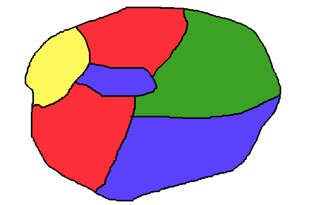
The Four Color Theorem is a mathematical statement about maps. All the example maps I found on the internet were too complicated to use for an intro, so I decided to make this shitty drawing instead:
If you squint, you can see that this is the same thing as a graph - you just shrink all the regions to a circle, and connect the circles if the regions were next to each other in the map:
The four color theorem says that you only need four colors to label any shitty drawing like mine (or its corresponding graph) so that no two adjacent regions are the same color. That means that if you take a map of the United States, of Europe, even with all the weird country borders in the middle there, and give each country or state a color, you'll only need four different colors to label the whole thing.
Some maps don't need all four colors. Some can be colored with two or three. A map that could be colored with one color wouldn't be very interesting, so we'll ignore those ones.
The first thing that struck me, as a software engineer, is that four colors is not very many. It seems astounding that any graph could be colored with four colors; I feel like if I drew a graph of some of the codebases I've worked on, with edges connected objects that communicate, they could easily require dozens of colors.
So, as you've guessed, there is a caveat to the four color theorem. The graph has to be planar. That means no edges can cross each other. It has to be able to be embedded on a two dimensional plane without crossings. That means that if you have a graph which has crossings, which can't be embedded in a plane, the four color theorem doesn't apply. It could require more than four colors, but you would need at least three dimensions to draw it without crossings.
So you can do this:
but not this:
Complexity
What is this about colors? Why should anyone care? Why did I bother to write this blog post? In a word, complexity. The number of colors required to color a graph is an indication of how complex it is - more complex graphs will require more colors. To get a feel for what this looks like in practice, let's try coloring some graphs. The following graphs both have the same number of nodes, but they require different numbers of colors to color (try coloring them yourself by clicking on the nodes):
The second graph intuitively feels more complicated, or at least less organized, than the first, and there's a concrete, measurable way in which it is more complicated: it requires more colors to color. The second graph requires four colors, while the first only requires two. Why?
The complexity comes from the nature of the interconnections in the graph. The second graph has some components that are very highly interconnected, while the first one does not. In fact, the first graph is formed by following a set of rules; it's a tree. The second graph was formed by me clicking around to deliberately create a lot of interconnections.
A graph can accomodate any number of connections without increasing in colors so long as it's orderly, governed by some rules or logic. The number of nodes connected to a single node doesn't matter:
nor does the number of pieces in the graph:
It's really just the highly interconnected components that increases the number of colors for a graph. A triangle gets you to three colors, but a triangle is actually very highly interconnected for the number of nodes it has: it's acomplete graph. Going from three to four colors is an interesting excercise. It requires you to start adding connections between components that are already connected. Let's say we wanted to merge the following two graphs:
There are ways to do it that don't increase the overall complexity, and ways that do. It all depends on how the extra edges are added:
(The second graph renders with a crossed edge, but it is actually planar. If you drag one of the bottom nodes up, it'll right itself.)
For the first graph, I used node 3 to connect to the second graph; node 3 is like the interface to the rhombus, it guards access to it. Following that pattern ensures that the complexity of the graph doesn't increase.
For the second graph, nodes 1, 2, and 4all have connections to the larger subgraph. There's no single node guarding the rhombus in this case; the larger graph was allowed to connect to multiple nodes in the rhombus. That led to an increase in the complexity of the overall system. Also, the complexity cascaded through much of the system - I couldn't just change one of the node's colors, I had to propagate that change throughout the larger subgraph.
Software
Looking at these graphs feels a lot like looking at a graph of dependencies in a codebase. If you add a node for each class, and draw and edge between the classNamees that communicate, you'll end up with a graph like the ones above. My talk of "components" and "modules" was influenced by thinking about these graphs in terms of software. The last example touches on an important point - you can manage a growing codebase without growing in complexity if you manage the way modules connect to each other. A codebase composed of small interconnected modules that communicate with each other in a well-defined way will have a lower complexity than one where the modules communicate with each other haphazardly.
This is an example of how it's better to manage interaction along a point than along an edge. By that I mean modules that present a single point of interaction will be able to maintain their own internal dynamics without polluting the complexity of the codebase. If programmers don't think about how they connect the modules in their codebase, and they end up connecting modules along multiple points of interaction, the complexity of the codebase will grow.
By the color measure of complexity, trees are very simple. They only require two colors to color. The structure of a tree prevents the interconnected clusters that cause a jump in complexity because the parent nodes guard access to the child nodes. In a dependency diagram, parent nodes would be like an abstraction on top of the functionality provided by the child nodes. If there were other nodes reaching in and connecting to the child nodes directly, that would represent a break in the abstraction.
The thing that prevents most dependency diagrams from being trees is code reuse. You want to be able to have a single object be used by multiple other objects. But only up to a certain point - you don't want a web view talking directly to the persistence layer, both because the web layer lives at a separate level of abstraction and because the web layer is likely to have other responsibilities, so talking directly to the persistence layer likely represents too much going on in one place.
My main takeaway from this exercise has been that a good way to manage the complexity of a codebase is to use objects that present an API on top of a group of others. The complexity of a graph never increases if you make connections by joining to a point that guards an internal graph. But if you expose the internal details, it's easy to end up with very complex graphs.
Addendum
Just for fun, here's a playground where you can try building graphs yourself. To connect nodes, click and hold on one, then click another. To change colors, click the node. You can generate a random graph or reset to an empty graph with the buttons.